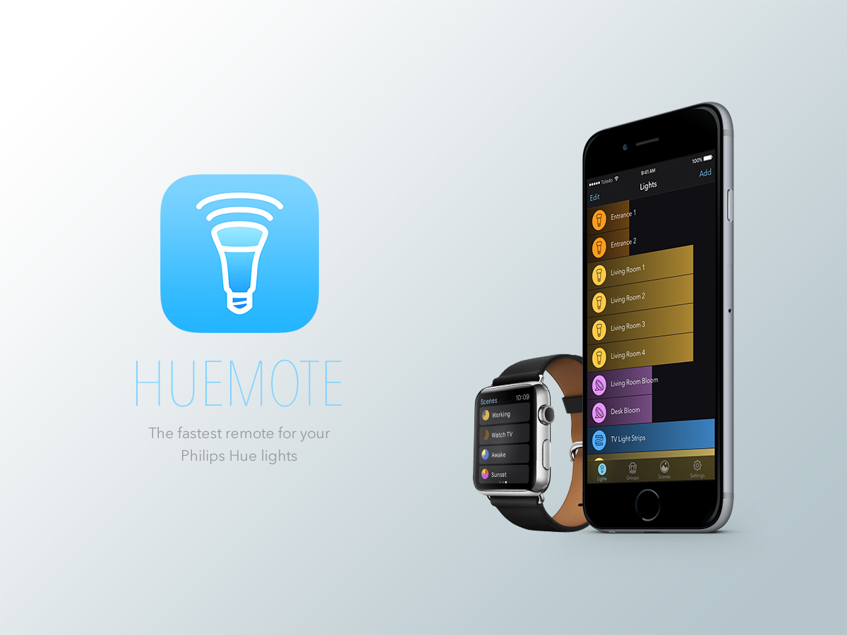
Huemote - A Year In Review

If you're an aspiring iOS developer or if maybe you do iOS development consulting for a living but never published an app on the App Store, it can seem very scary to get started. The uncertainty of the landscape, and the absence of any metrics to measure against can be a deterrent to get started or know if it'll be worth your time and effort.

I was deeply impressed when I first read Jared Sinclair's open and sincere post about his experience with his app Unread. Ever since, I truly believe that any developers that share any numbers regarding their apps helps everyone else trying to get started.

It's a splash of cold water in the face sometimes and a source of inspiration others, both equally valuable.

It's obviously naive and misinformed to think that your app will perform similar to another app. Having information from the source about how an app performs in the App Store is nothing more than one perspective. By itself it tells a story from a single point of view, but with enough of them, we can paint a rough landscape of the vastness of the App Store, and make more informed decisions. It's specially insightful when a developer publishes numbers for a category that hasn't been shared before, since at least there should be some parity in experience between apps that try to serve the same kinds of users.

In this post, I will outline how it's been for me in the year my app Huemote has been in the App Store, hopefully someone will find it useful, and if nothing else, it can become another data point for anyone trying to get a glimpse of what goes behind the closed doors of the App Store.

TL;DR

If you are just interested to know how a year in the life of an app looks like, then here's the breakdown for you:

  • 74,097 total downloads
  • 202 average downloads per day
  • 435 total users purchased a yearly patronage (for the last 5 months)
  • 24,617 monthly users
  • 400+ support emails
  • 393 reviews

If you are interested in the story of how it feels like, then stay for the article.

My approach to Huemote

When I got a Philips Hue starter kit as a Christmas present, the first thing I did was to embark on a search for the best Hue remote control in the App Store, and came out a bit surprised to find a few big players but none that fit the right balance of good design and powerful features for me. Coincidentally, the Apple Watch had just been revealed and I was itching to find an excuse to create an app for it.

Huemote was born out of necessity and curiosity. It was about to be my first app in the App Store, and I was going to develop it on my spare time. The goal for Huemote was not to make money, or to take over the market. I made Huemote knowing from the start that it would be competing primarily against Philip's official app, which is free and the majority of people will find perfectly acceptable.

I started developing Huemote with these goals in mind:

  • Explore the Apple Watch platform and capabilities
  • Gain some exposure and notoriety in the passionate circle of Hue users
  • Start building a repertoire of good-looking functional iOS apps under my belt

But I also wanted to release Huemote to be able to say I have sailed in the App Store waters, experienced it's changing tides and learn as much as I could so I could navigate smoothly in any feature endeavors.

All right, enough with the metaphors, here are some numbers.

Downloads

Huemote is a free to download app (I added a patronage in-app purchase in November 2015) so it's as frictionless to download as it can possibly be. When I submitted version 1.0 to the App Store, I did it mostly because of the imminent Apple Watch launch, however it didn't have all the features I hoped for. Because of this, I didn't really try to do much marketing or reach out to any prominent bloggers. Even if someone wanted to feature it, it would've been drowned in the vast amount of news and posts about the watch itself. Of course I tweeted about it and I did submit it to WatchAware but other than that, I let it grow organically.

So how did it do? Since it's launch in April 21st 2015 Huemote has been downloaded 74,097 times.

Downloads graph by appFigures

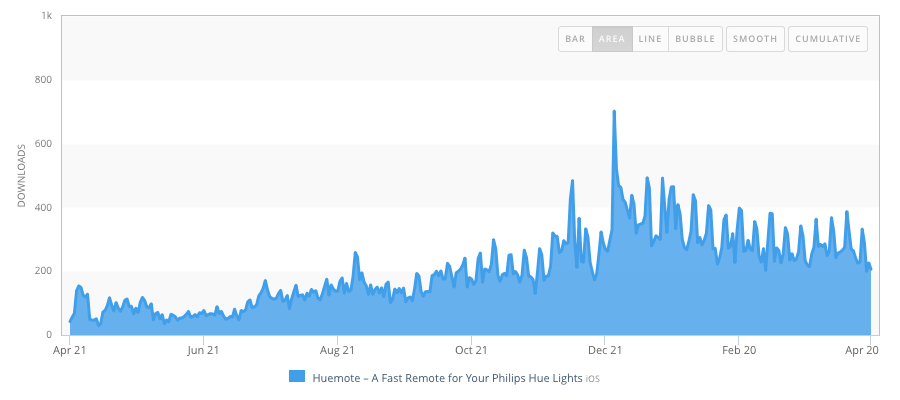
The Apple Watch was released on April 24th so naturally the first weekend in the App Store had a bump in downloads from people getting their Apple Watches and trying any app that offered watch functionality. That bump tapered right away after the weekend and I was seriously scared that I had just witnessed my best day in downloads and now my app was going to linger below the 150 downloads I got that Saturday.

Most other posts that share numbers point out that the biggest demand your app will ever have is the opening weekend. This is true if you do a big marketing push to get your app noticed obviously, but the benefit of not doing that is to enjoy a relatively steady climb in downloads as people organically discover your app. Of course if I'd had all my ducks in a row, I would've pushed harder for marketing, but in the end it was really encouraging to see Huemote's downloads growing week by week, eventually surpassing the opening weekend's record 3 months later and breaking it every week for a while after.

Here are a few highlights:

  • Average downloads per day in first year: 202
  • The day with the least downloads was May 4th: 29
  • The day with the most downloads was December 25th: 703
  • The top three countries: United States, Germany and The United Kingdom

The fourth was not strong with me, and the holiday spirit is real. All the folks getting either their first set of Hue lights or iPhones for Christmas were eager to try out new apps. Also, the first localization of Huemote will be in German.

In-app Purchases

In November 19th, 2015 I released Huemote version 1.1 which among several new features introduced a patronage model via a $2.99 in-app purchase subscription. I didn't want to charge for Huemote from the start because one of the main goals was to gain some exposure as a developer, so I wanted to get it in the hands of as many users as possible, but I also didn't feel comfortable charging for an app that I can't offer meaningful support since I work on it on my spare time.

However, many users wrote in to tell me they couldn't believe the app was free, and that they wished they could support me somehow, so I created a tip jar feature in the app at first. Then Marco Arment released overcast with the patronage model, and I decided patronage sounded way better than a tip jar.

In all seriousness though, it really got me thinking. I am in no rush to turn Huemote into a money making machine, but if I gain enough loyal users, that truly love the app and would support it because they depend on it on a daily basis, I thought it can become a good source of supplemental income with a yearly patronage model.

Although that hasn't happened at all, I have barely showcased the patronage option, the user will never see it unless they go to settings. I think as I release more features I can do a better job at displaying what's new in the app, and prompting the user to support the app if they wish to at the end.

Since November 19th, 435 users have purchased the Patronage 1 Year Subscription, netting $1,345 dollars before taxes and Apple's cut.

In-app purchase graph by appFigures

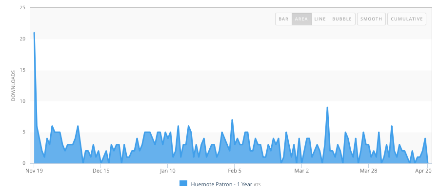
My biggest sale day was surprisingly (or maybe unsurprisingly) the very first day Patronage was available, on November 19th. I did a bit more marketing this time, I reached out to Federico Viticci and he posted Huemote on the Club MacStories newsletter. However the newsletter where Huemote was mentioned wasn't sent until November 27th, so all the sales for the first day were from power users that knew where to look after the update.

I thought that the Patronage sales would take a similar pattern to what I saw with the downloads, in a much smaller scale obviously, rising slowly but steadily. However that was not the case, I've never come close to beating the first day of sales, and it's more than fair to say the model hasn't been a financial success at all.

I have the luxury of being able to experiment with this app, since it' never been planned as a source of income, but if I ever want to make the jump to be an indie developer I'll definitely need to do much more to make a model like this work, or try something else entirely.

Some in-app purchase highlights:

  • Average sales per day (since patronage was available): 3
  • Most sales in a day: 21

An interesting tidbit, although December 25th was the day with the highest number of downloads, it was completely unrepresentative in terms of sales. It's one of the days with the lowest sales as a matter of fact.

Usage

I've said that Huemote wasn't created with the goal to make a lot of money, but rather to gain some notoriety and have a great piece of software under my belt. So how do I measure success? Number of downloads is obviously one way to look at it, but perhaps more importantly, I think the average number of users is a better metric.

There is a lot of talk about retaining users after day one. iTunes Connect even has a section in their App Analytics dedicated to "Retention".

I personally rely more on Fabric to get analytics, since the numbers reported in iTunes connect are based on opt-in only users, which is great but I tend to think those numbers may be higher than reality since I suspect the type of people that say yes to the opt-in prompt are power users.

I am not interested or encouraged to gather detailed demographic information about my users, but I do think it's important to know how my user base as a whole reacts to an update, or how it grows or shrinks after some important event.

I think monthly usage is a good metric for how many people actually use my app after downloading it, and not just put it on a folder or delete it after a couple days.

Monthly usage graph by Fabric

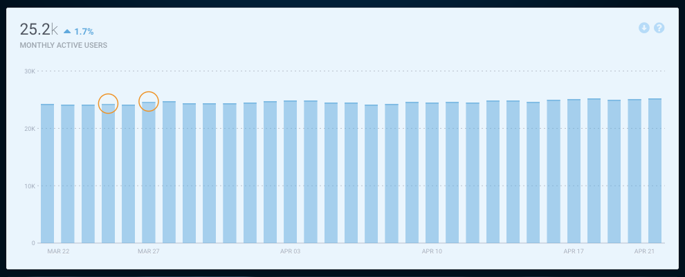
On average 24,617 users have used Huemote in the last month. Which if we compare against my total downloads to date, it's about 32% of users, which I'm very happy about. I don't know what is a normal ratio for a 'successful' app, since I haven't seen this metric being shared too much but I believe this is higher than usual.

This is the metric I've chosen to focus on, and one that I can improve by expanding my feature set and fulfilling the many feature requests I've received from passionate users that want more flexibility and control.

Reviews & Support

One thing I haven't seen shared a lot is what is the support load for a given app in the App Store, so I thought I would share some insight from my experience.

I just ran a quick filter trough my Huemote mailbox and I've received a little over 400 support emails in the year since the launch. So it's been really manageable, and I've been able to answer almost every single one of them. I love hearing from users, and most of the email I've gotten has been to praise the app or suggest a feature, which is very encouraging.

I also offer support via the Huemote Twitter account, which to date has only 115 tweets, so overall I'd say I am not overwhelmed with support requests at all, I even manage all of it via email, which seems crazy to some developers that get exponentially more support requests than I do.

Finally, one of the biggest surprises for me at least has been how many people will leave a review for the app even though I am not doing anything intrusive like a popup begging for reviews. I added a button in settings in the feedback section to let people review the app if they want to, and so many more users than I ever though would do it, leave a great review!

To date, Huemote has received 393 reviews with the following (rounded) breakdowns:

  • ★ ★ ★ ★ ★ - 84%
  • ★ ★ ★ ★ ☆ - 11%
  • ★ ★ ★ ☆ ☆ - 1%
  • ★ ★ ☆ ☆ ☆ - 2%
  • ★ ☆ ☆ ☆ ☆ - 2%

This also brings me immense joy and although I originally thought I would just out-right ignore reviews, it has become a meaningful metric for me to strive to keep improving.

Wrapping up

Everyone has different goals and metrics for success for their apps. From an outside perspective, maybe the numbers I've shared seem encouraging. Maybe they look like a total failure, I don't know. For me, and for what I've set out to do with Huemote, I've been really pleased with the response so far, and to be able to connect with so many users that seem genuinely interested with the app, and want to see it succeed.

I have enjoyed working on Huemote immensely and I will continue to do so, and maybe in the future I'll branch out to more lucrative endeavors in the App Store, but having an app I can learn from and measure against is an extremely helpful asset for any future projects I decide to do. I hope this insight is useful for you too.

Here are some other great posts sharing some insightful numbers:

Huemote 1.1

Huemote - The Fastest Remote for your Philips Hue Lights

On Christmas of 2014 my girlfriend gave me a Philips Hue starter kit as a gift. This was something I had been thinking of getting for a long time and it was the best gift I could've hoped for.

I immediately proceeded to set them up and downloaded the official Hue app. The app comes pre-bundled with a bunch of scenes that showcase the wide range of colors that the lights can achieve, and I played with all of them effusively for a bit. But then, I started to search for ways to simply control my lights, one at a time. You know, basic things, like turning off just this one light, or change the color of this one, dim just my desk lamp. But quickly, I realized that this type of interaction was not what the Philips Hue team had in mind, although you can do it, it is hidden away a couple screens deep and there is not a straightforward way of simply controlling your lights without using them in a scene.

Of course, my immediate next step was to hit the app store and search for third party remote controls. This was a roller coaster in and out of itself. I discovered apps that could pair your lights color and intensity to a music track, apps that simulated fireworks or candles, apps with sound effects, holiday themes, and other great fun things you could do with your lights. Of course I did all these, and indeed it was fun, but then, after all the firecrackers had died, the strobe effects had finished and the crazy color loops had passed, I had a bunch of apps on my phone, and none of them let me simply control my lights in a straightforward way for every day use.

That's when Huemote was born. It was born out of necessity, and out of love for my shiny new lights. Huemote was envisioned from the start as a simple tool that could serve as my daily use remote control, and it's focus has always been speed. I wanted immediate access to my lights state, brightness and color, not tucked away past several screens or with weird UI elements that looked great but got in the way of me controlling my lights.

Today, Huemote is taking the next step. The first version had the most basic implementation of my idea for an every day remote control: fast access to all your lights, and a way to control multiple lights together as groups. But it was lacking several key components that I had originally envisioned but didn't have the bandwidth to do at the time. The most glaring omission was support for scenes, and a today widget to control lights without even unlocking the phone.

Well, I'm happy to say that these features are finally here in Huemote 1.1. This version of Huemote is what I truly envisioned as a 1.0, and it brings fast access to scenes, an improved Apple Watch app, a today widget and iCloud sync so all your settings transfer between all your devices.

Huemote also introduces a way to support further development of the app. Huemote is not my main job, and as such I can't dedicate all my time to it's development and support. Because of this, I've had mixed feelings about charging for the app, since I can't really commit to keep improving it at a pace comparable to other apps. But surprisingly, a lot of people have asked me for ways to contribute, and to support it's development. This is why I'm introducing a patronage model, where you can contribute and support the development of the app. There are many features that I consider essential for an everyday remote control, like support for the Hue Tap and Hue Dimmer switches, changing light colors by color temperature, timers and alerts, and many more.

I'll have much more to say about the patronage model, the state of the app store, and the future of Huemote on other platforms, but for now I just want to close by sharing what I think is the most valuable thing I've learned from developing Huemote.

Although this is my first app on the store, I've been developing for iOS for a couple years now, and I've been following people in the industry for way longer than that. From an outsider's perspective, I had been trained to expect the worst on the app store. I had been told that you need a skin as thick as a rhino to read your reviews, or to see your comments on twitter. I was told 4 stars will be held hostage on every review until I delivered a certain feature, and that if I offered a support email, it would be flooded with demands and complaints.

Maybe this is true for very popular apps, or maybe this is something inevitable that happens once you reach a certain popularity threshold, I can't speak to that. But I can say this: the response from users, and from the community has been nothing like that. It's been the opposite. I have been utterly astonished with the amount of positive feedback and constructive criticism I've received from users. Kind words, thoughtful feature requests, uplifting comments are the only things that have filled my inbox so far. 5 star reviews that make effusive comments, ask for features or crack a few jokes have been the norm, not the exception.

I am not pointing this out to make myself feel good (although it certainly does). I'm doing it because maybe someone reading this has the misconception that launching something on the app store is bound to be bundled with hateful emails, unreasonable demands and toxic comments. That there are only few users who appreciate your work, and truly wish you success because it will mean the app they love will grow and flourish. But this has been far from my experience. I've been deeply moved by the users that have tried Huemote, and that have taken time to write long and insightful emails, thoughtful reviews and kind words on twitter. Launching something is hard, there's always uncertainty, there's always fear. But when you hear first hand from users how much they enjoy your product, or how it has saved them time or made things easier for them, it truly makes it all worth it.

If you've had second thoughts about launching a product, or maybe you think there's the possibility no one will like it, take a chance. The reward from hearing from people who do, will far outweigh your fears and doubts, I promise you.

If you have installed Huemote, go ahead and update from the App Store! If you haven't, give it a try, and either way, I always appreciate to know what you think.

Download Huemote from the App Store

iOS Home Screen Logic

The term 'Personal Computer' has been around since 1974, however you can make a very compelling argument for calling the iPhone the first truly personal computer. This is a computer that goes with you everywhere you go, and that often stores your most valuable information as well as give you access to your most valuable assets.

As such, it's no surprise that the way people arrange their home screens is as personal as each individual. What works for some people wouldn't ever work for their friends, or even their family. Sometimes my girlfriend asks me to check something on her phone while she's doing something else, and I have to always resort to pulling spotlight because the combination of apps and groups in multiple screens drives me mad. She can, however, find whatever app from whatever category in an instant with a swipe or two.

Because of this, I'm always fascinated when someone posts their home screen and explains the reasoning behind it. It's a tiny peek at how that person's mind works. However, every time I see a blog post or I hear someone explaining their home screen logic, there's invariably a moment when I cringe and want to yell: "But what about this! How does this make sense? Why?!".

So instead of doing that, I'm taking this chance to present my logic for My Very Personal Perfect Home Screens™. Notice the plural use of screen? If I just posted a screen shot of the home screen # 1 on my phone, this would be a very short and pointless post, because I essentially almost have it the exact same way Apple delivers the iPhone. But hence the importance of this post. I think that the system as a whole is far more important than what you choose to put on the screen # 1. The first screen is only a part of the system, so in this post I'll try to paint a picture of my entire system, but don't fret. It's only 3 screens.

An Almost Stock Home Screen

My First Home Screen

Yes, this is my 'Home Screen'. If you are pulling your hair out from having essentially no non-Apple app on my first screen, just hang on. I've probably formed this habit since Apple released the App Store. Back in those days, all of Apple's pre-installed apps fit in one 320x480 screen with no app folders. Every new app I installed on my phone, I started placing after the first home screen. To me, it is a logical divide: The system apps, and everything that is from a third party. The rule is simple, if I long-press and there is no (x) button on the corner, it goes in the first home screen.

I found this quite useful over the years, when I need to do a system function, get a new app, deal with storage on the phone, my brain is already wired to look for it on the first screen.

That being said, this is not the screen I spent most of my time on, obviously. If I were trying to fit a screenshot into all the collections that show only 1 home screen, I would consider my second home screen to be my true home screen, where my most used apps live. But given the way the iPhone works, when you unlock your phone it opens to the same home screen you were before you locked the phone. So 90% of the time, when I unlock my phone I'm actually taken to my middle home screen. But more on that in a minute.

The Dock

I think I would get a headache trying to come up with a third-party app that would be suited to fill a space in the dock. With all the ways we can launch most used apps these days, and essential tools from the lock screen or control center, I don't think I would justify any app other than a system app to be on the dock. I treat the dock as the essential apps. Could I continue to use my phone without the 4 apps on the dock? If the answer to that question is yes for any of the apps, then I don't think that app belongs in the dock. That doesn't necessarily mean that I don't find any other app indispensable, but these to me sum up the core functionality of the device.

The first 2 are essential communication for me. I know a lot of people make the joke that the last thing you do with your phone is make a phone call, but regardless of comparative usage, it's still the most universal communication feature of the iPhone. A phone that doesn't make phone calls, is not a phone. I was tempted for a very long time to use WhatsApp instead of Messages but I couldn't stand the dock with a third party app in it. However, it doesn't really matter anymore, since iMessage launched, I actually use Messages more than WhatsApp at this point, so it is essential for communication.

Finally, I consider email and safari essential features of my personal computer. I am a 'completionist', and it's pretty important for me to know if there's new information waiting for me, no matter what screen I'm on at the moment. Safari truly made the iPhone, in Steve Jobs's own words, a "breakthrough Internet communications device". Being able to open a fully functional web browser at any instant is still to me the biggest stock feature of the iPhone. All of the world's knowledge, truly at your fingertips. And a web browser can't be boxed into any particular type of feature. Need to look up what time a restaurant closes? Open Safari. Want to know how's the weather this weekend in Tahoe? Open Safari. Are you trying to win a bet with a friend and need to know the correct answer? You bet. Of course a lot of these use cases can be replaced with native apps, but no other native app is as versatile and serves so many use cases as a web browser, and Safari is an incredible one.

My Main Home Screen

My Second Home Screen

No Apple stock apps make an appearance after the first home screen. These are by far and away my most used apps. My only rule here is: no app folders. This screen is the most likely to change over time, but that doesn't mean it's volatile. It takes an app that integrates deeply into my life to make it to this home screen. I have no rules for number of apps or number of rows, although I like no gaps of course.

Each and every one of these apps is used if not daily, definitely a couple times a week at least. When this list gets too big, I know I probably have a workflow problem, and I may need to streamline or combine some use cases. I like to keep this as minimal as possible, if I ever feel like I'm forgetting something I needed to do, most likely it can be found within this screen.

One great advantage for having the most used screen be the middle screen, is that depending on what I'm looking for, I can get to it with one swipe in either direction, although to be honest, if an app is not in this screen, I am most likely looking for it with spotlight.

Everything Else

My Third Home Screen

It's hard enough trying to come up with a logical way to apply hierarchy and order to 1 home screen, so I want to avoid doing that as much as possible. But instead of letting everything else flow freely and ripple through who knows how many home screens, I prefer to enforce one rule for the third and final home screen: everything goes into a folder.

I tried at first to come up with categories and most importantly category names that would fit an app always. But turns out it's almost impossible to do that. I started with the auto-suggested app category names, but that is not practical or a categorization that resembles real life. And coming up with a category name generic enough and broad enough to encompass a useful amount of apps is tough business. We need a higher level of abstraction, a language to communicate ideas and emotion, not specifics. Enter emojis!

I can't remember where I saw the use of emojis as a folder name before, but once I saw it, it immediately sparked something in me. Emojis are perfect for broadly categorizing a group of apps and vaguely expressing their purpose. So far I have rough categories for tools (🔧), finances (💵), transportation (🚖), messaging (💬), games (🎮), travel (✈️), shopping (💳), and development (🔨).

Of course now that the abstraction of the emojis have helped me categorized my apps, I could just use the labels I just mentioned, but emojis are still so unique that their pictogram is faster to recognize than trying to read "Shopping".

I think carefully before creating a new category if I truly need it, or if it can be bundled somewhere already. This has lead to "tools" becoming a very generic category, which I may need to subcategorize in the future.

In any case, I rarely enter any of the folders. When I need any of these apps, my first instinct is to pull down on my main screen, and start typing on spotlight.


There is no perfect system, and I don't expect this logic to work for anyone else but myself, however it does work great for me, and serves not only for organization, but for focus as well.

I didn't go into detail about my choice for a home screen background, because that can be a topic in an out of itself, but suffice to say I agree completely with what CGP Grey had to say in his discussion with Myke Hurley on home screens in the Cortex podcast. A dark minimal background makes, almost universally, every icon stand out without any readability issues.

If you're interested in the background I'm using, it's called Noir from Boris P. Borisov, and you can find it in his Behance profile.

One more thing...

A home screen post is not complete without a look at someone's lock screen. I took a high resolution illustration by Javier Ocasio I found on DeviantArt and added some lighting effects.

My Lock Screen

Stay Hungry. Stay Foolish.

In the summer of 2008, I was about to graduate from the Digital Arts & Design program at Full Sail University, and I was asked to give my program's graduation speech.

Full Sail is not a traditional university, and as such didn't have a traditional way to select graduation speakers. In traditional universities, the Valedictorian usually gives the class graduation speech, but at Full Sail, at the end of the program the students and the faculty vote to select the recipient of the Advanced Achievement Award, a fancy name for The Graduation Speaker Award.

Now, I don't consider myself a natural public speaker, but I had been able to manage a few small audiences before. However that was in Spanish, my native tongue, and not to an audience of 3 graduating programs combined.

I needed some help, so I took it to the internet to find inspiration. It didn't take long for me to stumble upon Steve Jobs's wonderful 2005 Stanford Commencement Address. In the most quintessential way, Steve Jobs does in this speech what he did best in life: he simplifies a very complex system (life) to the simplest possible form, so that it can be understood and used by his audience.

From his life experience, he distills 3 stories into a simple message:

Your time is limited, so don't waste it living someone else's life. Don't be trapped by dogma — which is living with the results of other people's thinking. Don't let the noise of others' opinions drown out your own inner voice. And most important, have the courage to follow your heart and intuition. They somehow already know what you truly want to become. Everything else is secondary.

His closing statement is a phrase from the back cover of a publication he followed during the 1960s: The Whole Earth Catalogue.

On the back cover of their final issue was a photograph of an early morning country road, the kind you might find yourself hitchhiking on if you were so adventurous. Beneath it were the words: "Stay Hungry. Stay Foolish." It was their farewell message as they signed off. Stay Hungry. Stay Foolish. And I have always wished that for myself. And now, as you graduate to begin anew, I wish that for you.

This phrase made such a big impression on me. It sums up so much great advice from many other masters into a succinct statement. It's the ultimate advice. The day we lose our ability for astonishment, our curiosity, our desire to keep learning, is the day we stagnate. This is true for our work, for our relationships, for individuals and corporations, this is true for life.

Like everyone else graduating beside me, I had no idea how I was going to use what I had learned during my years of college, but suddenly the road ahead didn't look so scary anymore, it was instead, full of opportunity. For I was foolish and hungry at the time, I had just graduated, I didn't know anything about the real world, and I was so eager to learn, I was so hungry for knowledge, so ready to fail.

I strove to live up to this motto ever since. I can't say I have a perfect record of course, but every time I start to feel like I'm slowing down, or like I've mastered something I always come back to this phrase. If I feel like I haven't seen much failure lately, if I haven't made many mistakes, then something is not right. It's time to learn something new, time to venture into an unknown technology, time to be a novice again. It doesn't sound like it, but it's gratifying, and even addicting.

Today it's another small step in that direction. Since I graduated, the world has changed significantly thanks to technology, and in no small part thanks to Steve. An entire mobile revolution came in full swing, and it seems like it's starting to settle, paving the way for new revolutions to come. I've been a bystander all this time, following intelligent people give their accounts of the facts and opinions on the matter. But I've been just watching and reading from the sidelines, and I have so much to say.

This will be my outlet for expression, for analysis and critique. For sharing what I learn and for learning a few things about myself. I hope you find it interesting and hopefully learn a few things yourself.

The Whole Earth Catalogue Final Issue Back Cover