iOS Home Screen Logic
The term 'Personal Computer' has been around since 1974, however you can make a very compelling argument for calling the iPhone the first truly personal computer. This is a computer that goes with you everywhere you go, and that often stores your most valuable information as well as give you access to your most valuable assets.
As such, it's no surprise that the way people arrange their home screens is as personal as each individual. What works for some people wouldn't ever work for their friends, or even their family. Sometimes my girlfriend asks me to check something on her phone while she's doing something else, and I have to always resort to pulling spotlight because the combination of apps and groups in multiple screens drives me mad. She can, however, find whatever app from whatever category in an instant with a swipe or two.
Because of this, I'm always fascinated when someone posts their home screen and explains the reasoning behind it. It's a tiny peek at how that person's mind works. However, every time I see a blog post or I hear someone explaining their home screen logic, there's invariably a moment when I cringe and want to yell: "But what about this! How does this make sense? Why?!".
So instead of doing that, I'm taking this chance to present my logic for My Very Personal Perfect Home Screens™. Notice the plural use of screen? If I just posted a screen shot of the home screen # 1 on my phone, this would be a very short and pointless post, because I essentially almost have it the exact same way Apple delivers the iPhone. But hence the importance of this post. I think that the system as a whole is far more important than what you choose to put on the screen # 1. The first screen is only a part of the system, so in this post I'll try to paint a picture of my entire system, but don't fret. It's only 3 screens.
An Almost Stock Home Screen
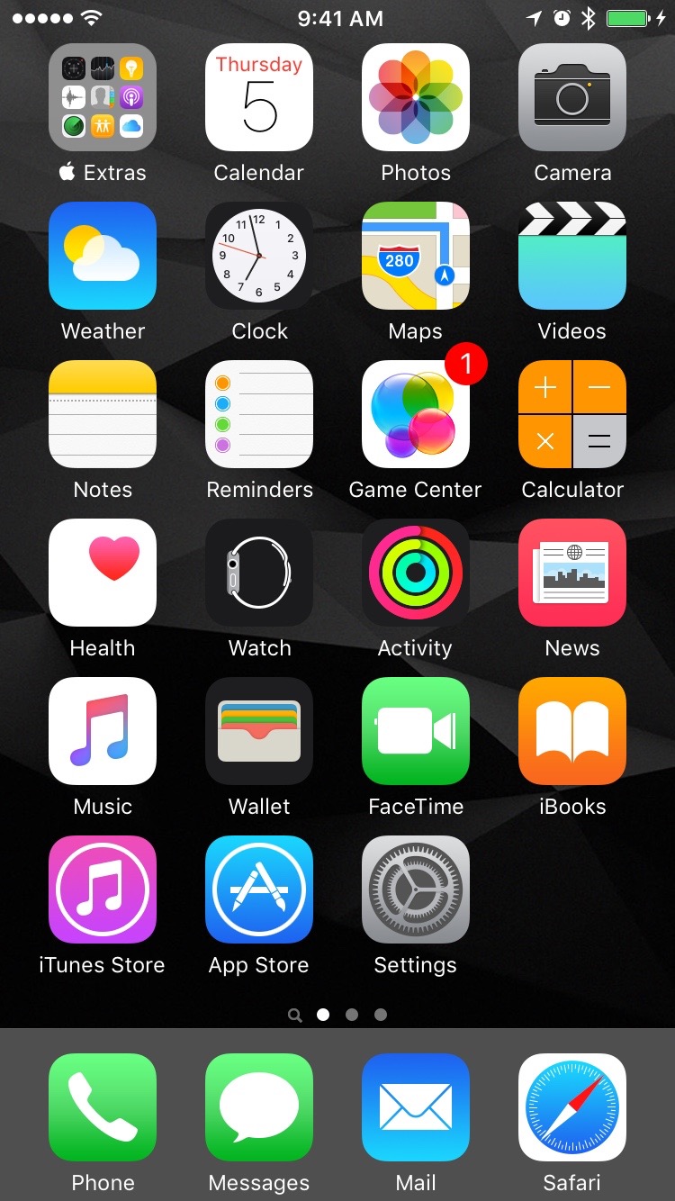
Yes, this is my 'Home Screen'. If you are pulling your hair out from having essentially no non-Apple app on my first screen, just hang on. I've probably formed this habit since Apple released the App Store. Back in those days, all of Apple's pre-installed apps fit in one 320x480 screen with no app folders. Every new app I installed on my phone, I started placing after the first home screen. To me, it is a logical divide: The system apps, and everything that is from a third party. The rule is simple, if I long-press and there is no (x) button on the corner, it goes in the first home screen.
I found this quite useful over the years, when I need to do a system function, get a new app, deal with storage on the phone, my brain is already wired to look for it on the first screen.
That being said, this is not the screen I spent most of my time on, obviously. If I were trying to fit a screenshot into all the collections that show only 1 home screen, I would consider my second home screen to be my true home screen, where my most used apps live. But given the way the iPhone works, when you unlock your phone it opens to the same home screen you were before you locked the phone. So 90% of the time, when I unlock my phone I'm actually taken to my middle home screen. But more on that in a minute.
The Dock
I think I would get a headache trying to come up with a third-party app that would be suited to fill a space in the dock. With all the ways we can launch most used apps these days, and essential tools from the lock screen or control center, I don't think I would justify any app other than a system app to be on the dock. I treat the dock as the essential apps. Could I continue to use my phone without the 4 apps on the dock? If the answer to that question is yes for any of the apps, then I don't think that app belongs in the dock. That doesn't necessarily mean that I don't find any other app indispensable, but these to me sum up the core functionality of the device.
The first 2 are essential communication for me. I know a lot of people make the joke that the last thing you do with your phone is make a phone call, but regardless of comparative usage, it's still the most universal communication feature of the iPhone. A phone that doesn't make phone calls, is not a phone. I was tempted for a very long time to use WhatsApp instead of Messages but I couldn't stand the dock with a third party app in it. However, it doesn't really matter anymore, since iMessage launched, I actually use Messages more than WhatsApp at this point, so it is essential for communication.
Finally, I consider email and safari essential features of my personal computer. I am a 'completionist', and it's pretty important for me to know if there's new information waiting for me, no matter what screen I'm on at the moment. Safari truly made the iPhone, in Steve Jobs's own words, a "breakthrough Internet communications device". Being able to open a fully functional web browser at any instant is still to me the biggest stock feature of the iPhone. All of the world's knowledge, truly at your fingertips. And a web browser can't be boxed into any particular type of feature. Need to look up what time a restaurant closes? Open Safari. Want to know how's the weather this weekend in Tahoe? Open Safari. Are you trying to win a bet with a friend and need to know the correct answer? You bet. Of course a lot of these use cases can be replaced with native apps, but no other native app is as versatile and serves so many use cases as a web browser, and Safari is an incredible one.
My Main Home Screen
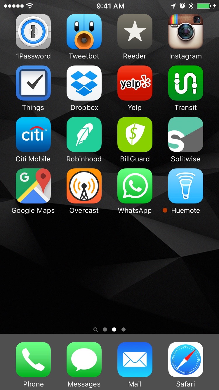
No Apple stock apps make an appearance after the first home screen. These are by far and away my most used apps. My only rule here is: no app folders. This screen is the most likely to change over time, but that doesn't mean it's volatile. It takes an app that integrates deeply into my life to make it to this home screen. I have no rules for number of apps or number of rows, although I like no gaps of course.
Each and every one of these apps is used if not daily, definitely a couple times a week at least. When this list gets too big, I know I probably have a workflow problem, and I may need to streamline or combine some use cases. I like to keep this as minimal as possible, if I ever feel like I'm forgetting something I needed to do, most likely it can be found within this screen.
One great advantage for having the most used screen be the middle screen, is that depending on what I'm looking for, I can get to it with one swipe in either direction, although to be honest, if an app is not in this screen, I am most likely looking for it with spotlight.
Everything Else
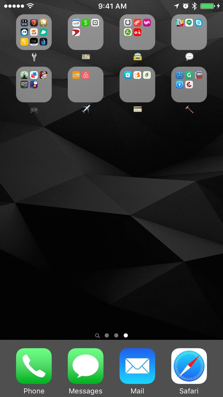
It's hard enough trying to come up with a logical way to apply hierarchy and order to 1 home screen, so I want to avoid doing that as much as possible. But instead of letting everything else flow freely and ripple through who knows how many home screens, I prefer to enforce one rule for the third and final home screen: everything goes into a folder.
I tried at first to come up with categories and most importantly category names that would fit an app always. But turns out it's almost impossible to do that. I started with the auto-suggested app category names, but that is not practical or a categorization that resembles real life. And coming up with a category name generic enough and broad enough to encompass a useful amount of apps is tough business. We need a higher level of abstraction, a language to communicate ideas and emotion, not specifics. Enter emojis!
I can't remember where I saw the use of emojis as a folder name before, but once I saw it, it immediately sparked something in me. Emojis are perfect for broadly categorizing a group of apps and vaguely expressing their purpose. So far I have rough categories for tools (🔧), finances (💵), transportation (🚖), messaging (💬), games (🎮), travel (✈️), shopping (💳), and development (🔨).
Of course now that the abstraction of the emojis have helped me categorized my apps, I could just use the labels I just mentioned, but emojis are still so unique that their pictogram is faster to recognize than trying to read "Shopping".
I think carefully before creating a new category if I truly need it, or if it can be bundled somewhere already. This has lead to "tools" becoming a very generic category, which I may need to subcategorize in the future.
In any case, I rarely enter any of the folders. When I need any of these apps, my first instinct is to pull down on my main screen, and start typing on spotlight.
There is no perfect system, and I don't expect this logic to work for anyone else but myself, however it does work great for me, and serves not only for organization, but for focus as well.
I didn't go into detail about my choice for a home screen background, because that can be a topic in an out of itself, but suffice to say I agree completely with what CGP Grey had to say in his discussion with Myke Hurley on home screens in the Cortex podcast. A dark minimal background makes, almost universally, every icon stand out without any readability issues.
If you're interested in the background I'm using, it's called Noir from Boris P. Borisov, and you can find it in his Behance profile.
One more thing...
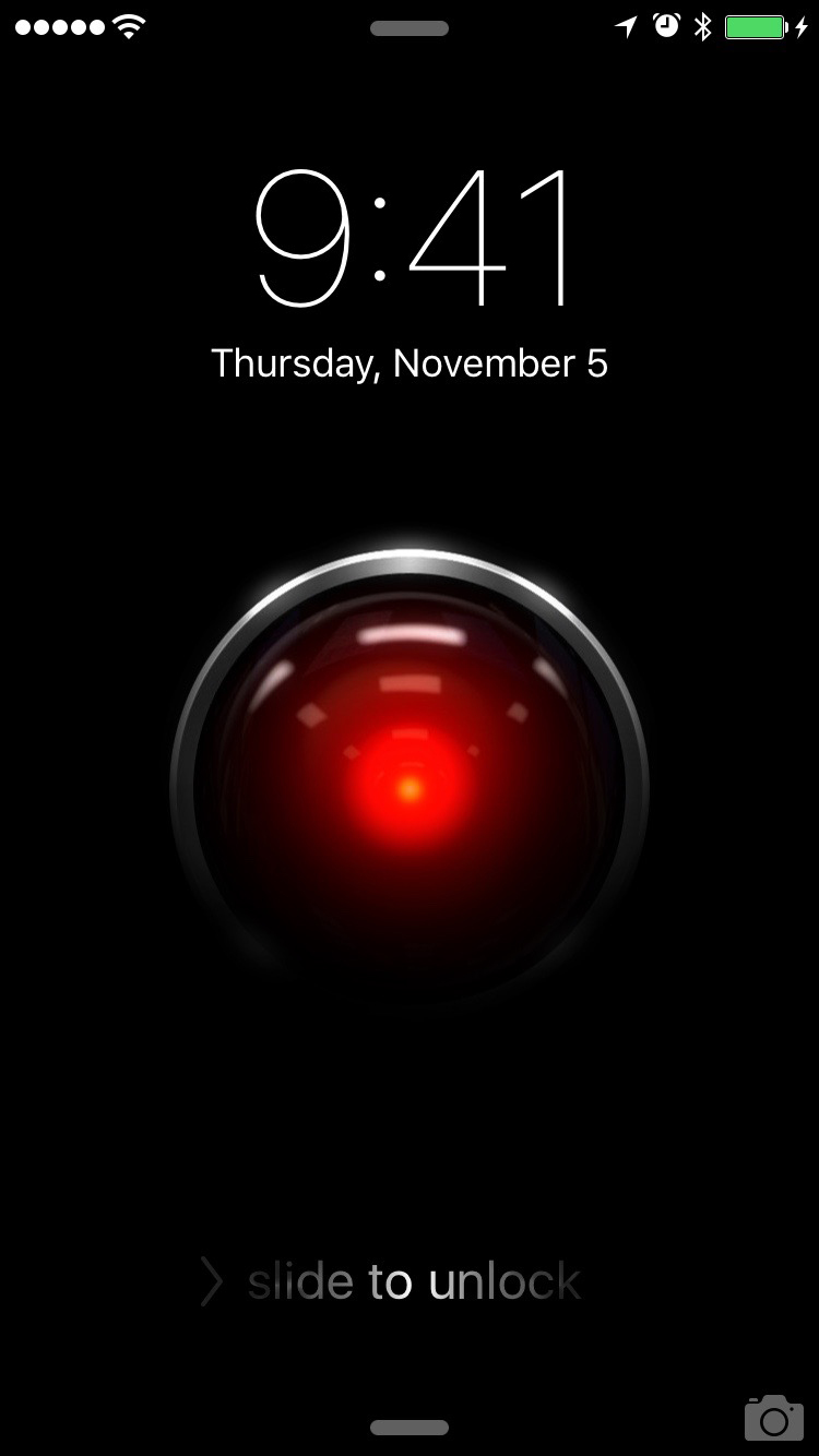
A home screen post is not complete without a look at someone's lock screen. I took a high resolution illustration by Javier Ocasio I found on DeviantArt and added some lighting effects.